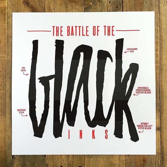
The Battle of the Black Inks: Redux

And we’re back! The response to the original Battle of the Black Inks post was amazing, thanks to everyone that checked it out, liked it, and gave me feedback. If you haven’t read it already, go check it out — this post will make much more sense if you’ve read the original. Along with interest in the post & process, there was enough interest in buying a print -- so I reprinted it! That reprinting is what this post is about. So read on to find out what was different the second time around. If you’re just super anxious to buy the print — be our guest and Buy the Print!

I wanted to revisit the Battle of the Black Inks print for a number of reasons. First, people said they were interested in buying one and the initial run was tiny and didn’t really yield many extra prints for sale. Second, some of the methods used the first time around (e.g. frankensqueegee) yielded less than great results, I figured it was only fair to give them another shot. Lastly, I felt like the first print didn’t turn out exactly like I imagined and I wanted to make a couple of changes.

What Changed?

All of the inks were printed on separate 250 mesh screens: this slowed production in a major way (e.g. 5 black screens instead of two), but gave me an opportunity to address the quirks of each ink (e.g. corners drying in, ink being too thick) — this helped immensely. Each ink needs a certain type of finessing and this allowed for that.

I brightened up the color in the red layer, printed it through a higher mesh, and replaced the handwritten type with a more Letraset-style type: this improved readability and just cleaned up the vibe a little. The type is House Industries Dirtyhouse for those of you playing Name-That-Font® at home. The handwritten labels on the first print turned out ok, but I wanted something a little more clean and legible. To get a bright red, I used a straight up 50/50 mix of Speedball Dark Red and Medium Red — both were of the Speedball Permanent Acrylic family. This yielded a nice, bright red that popped off the paper and married well with the large amount of black ink that was laid on the paper. We printed the red through a 280 mesh screen. Some uneven spots in the perimeter of our table caused a little inconsistency with the pressure on the red layer, so the benefit of the higher mesh was lost on this run.

Thinned the Jacquard #117 ink: This ink drove us crazy in the original Battle of the Black Inks post. Per a recommendation from @jacquardproducts on Instagram, we thinned the ink. You can read below how that affected the printing.

I printed this on Cougar Cover White 100lb: This paper was a little smoother than the French stock and more readily available — this didn’t really affect too much. It may have absorbed less ink than the French stock, but its tough to tell. I still prefer French Paper, but I can’t quite put my finger on why.

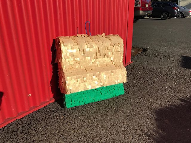
We used a single durometer, harder squeegee: All inks were printed with an 80 durometer squeegee in favor of the 70/90/70 durometer squeegee used the first time around, the stroke sequence was flood/pull… just how we like it! Also, used the Ergoforce handle — love those things.

Other than that: all other things from the first run stayed almost exactly the same...

The Inks Revisited

Speedball Professional Poster Black

This one was the winner before for a few good reasons and it stayed that way. Super easy to print, easy to clean, nice finish, texture stayed consistent throughout the whole run. The finish tends more towards the chalky end of the texture spectrum, but we like that look *and* all of the other factors make it the top performer.

Ryonet Green Galaxy Pitch Black

This was a pleasure to print the first time around and the second time was no different. Actually, it was different... it was better! Great consistency, pulls extremely easily, clean print with a single stroke and cleanup couldn’t have been easier. It also never showed any signs of drying in. This has got to be right up there with the Speedball Professional Poster Black. I'll be leaning on this more and more for sure and there's absolutely no contest that this wins "Best Label Design" -- it's not even close.

Jacquard Professional #117

This is easily the most improved ink of the bunch. When I posted the original blog post, Jacquard contacted us and made us aware that the ink isn’t meant to be used straight from the jar and would need to be thinned with water. We took their advice and thinned it with water…and it made all the difference. It went from the worst performing ink to one of the best. It printed easy, yielded clean prints, has a nice semi-gloss finish and stayed open for the whole 80 piece run. Very pleased with this ink and look forward to using it in the future.

TW Graphics WB-5525

This one fought us a little bit during the first run, performed much better in the second run. We did notice some drying in around the registration marks, but the ones that were drying in were closer to the squeegee ends and perhaps not getting enough pressure. One weird thing we noticed was that the ink seemed really gummy by the end of the run, so gummy that we decided to scrap the small amount of leftover ink rather than dropping it back in the bucket. Cleanup was still a nightmare, the ink wants to dry in so badly that it's a frantic race to clean it up before the ink locks up completely. Getting the SO-34 cleaner from TW Graphics is a must, keeping a spray bottle of it handy is a double must. Definitely still more highly recommended for those printers that are moving real quick.

Nazdar 2724 All Purpose Screen

This one performed about the same. Less drying in, mostly due to being printed on a single screen with an appropriately sized squeegee. Did notice with that the longer run, the ink really seemed to tighten up. It got really gummy near the end of the run and seemed to make the screen want to stick to the paper even with the vacuum and adequate off-contact. However, that gloss would make some of the trouble worth it. For the right projects, I will definitely be using this.

The Awards

We did 'The Winners' the first time around, it seems only appropriate that we switch it up this time. These awards are based on things that were discovered in both of the Battles

THE FIRST INK WE'RE GOING TO GRAB AWARD

The Speedball Professional Poster Black continued to be our favorite, but! The Ryonet Green Galaxy Pitch Black ink performed so well that we will likely use both as our go-to inks. Perhaps Speedball for posters and Green Galaxy for shirts. Either way, you can't go wrong with these two have a container of each and you'll be ready for any job -- as long as it only needs black ink.

The Most Improved Award

This easily goes to the Jacquard Professional #117 ink. We pretty much hated this ink apart from its finish in the first Battle print. Once @jacquardproducts talked some sense into us on Instagram -- we saw the light. The same great finish that we'd seen before, but with much less frustration. Jacquard #117 is an ink that I can confidently say I won't shy away from using. Very happy we gave it another chance and found a great ink hiding under the hyper thick texture.

The 'Better, but Still a Minor Pain' Award

I said that TW Graphics WB-5525 is 'Best for Fast Printers' in the first Battle post, I definitely stand by that even after the second go at it. A wider, harder squeegee definitely seemed to help. Dry in was only a small issue, but cleanup was still a pain. With more experience I'm sure I'd figure a way to make the cleanup easier, but I'll probably wait until I'm on an automatic press to lean on TW as my go-to.

The 'I Need Some Gloss' Award

Much like the TW 5525 mentioned above, the drying in of the Nazdar 2724 All Purpose was a much smaller issue this time. It was just difficult enough to work with that I'll keep the container, but I'll only be reaching for it when I need some gloss on what I'm printing.

What I'd Change

I wouldn’t have minded making this print bigger, maybe 18”x18”. My space isn’t really set up for printing on a larger scale and yes, that’s large for my space. Also, due to my washout booth being in the same room where I’m drying prints — the humidity fluctuating proved to be a real headache. The expansion and contraction of the paper made registration a minor problem. I ended up eyeballing the registration, in favor of depending on the registration marks, on the last 3 black colors and luckily the way the art was created, it is barely noticeable. I would definitely like to not have to worry about that -- having a larger studio would definitely solve that problem. I'll put that on my "List of Things to Get", I'm sure I'll get to it in no time.

The Closing Thoughts

Going through this process again was mostly positive. It was definitely nice to be able to make a few changes I had a few false starts where I'd get into printing another edition only to run into a major issue. I'm very happy to be done with it, I'm also very happy to have my opinions of one of the inks change due to using it properly, the Jacquard #117 in particular. Printing with 5 different brands of the same color ink on one sheet is something that I've always wanted to do and I'm happy that I got the chance to do so in this context. The lesson that I've taken away from both posts is that these inks are all capable and there are so many factors that contribute to their success or failure -- try as many as you can and find what works for you. Also, don't be afraid to contact companies and distributors direct and ask for a sample. Worst case scenario is they say, "no." Best case scenario is that you can try inks with no risk to you.

The Print

Ok, that was a good amount of words and we'll end on this -- the print is now for sale in the Floodpull store! There are 60 copies available for purchase. It is $20 plus $5 shipping to anywhere in the contiguous United States. It is unsigned, unnumbered edition of 80 prints total - 12”x12”, 6 colors (red, 5 black inks) and it ships flat in a screen printed mailer with some really fun hand printed packing materials that I really hope you’ll enjoy! To keep Floodpull going (and not just funded out of pocket forever), projects like this will probably be a necessity and we appreciate anyone who buys a print, anyone who tells their friends about us, anyone who leaves a comment on Instagram...basically, we appreciate everyone and can't say thank you enough for all of the support and encouragement you've offered throughout this process.

What's Next?

We'd love to do more prints like this and put together a small series. The Battle of the White Inks will probably be next. However, it'll be a while until we get the nerve to take on another project like this, just know that we're thinking about what comes next. In the meantime, we are going to work on some simpler prints and more product reviews. Thanks for following along!


Just as cool with a few new layers of difficulty.

Buy this: Screen Printing Today by Andy MacDougall

The only book you'll need about screen printing. Photo: Squeegeeville

I've written about this book before on Instagram, so check that post out if you haven't already. I'm going to repost some of the thoughts that I had about it here with some minor changes. Enjoy!

When people talk to me about getting started in screen printing, I typically point them towards all of the usual suspects. Check out videos on Youtube -- Ryonet & Catspit are great places to start and learn about the process and equipment. If you need some supplies, buy them from AnthemBlick, Ryonet, or Pocono Screen Supply; however, before i do any of that, I tell them to get a copy of this book, Screen Printing Today by Andy MacDougall. Andy wrote a book unlike any other that had been written before it, a book that covers modern screen printing from top to bottom. It is truly an exhaustive look at what goes into the process from creating art to putting that art into production via the almighty silkscreen. The book is loaded with pictures, so you don't just need to lean on words to gather concepts. The kicker is that he has plans for a vacuum table for flatstock *and* a plan for a t-shirt printing jig in the back of the book. This book is the resource to reference if you're just learning how to screen print, even if you've been printing for ages -- everyone can learn something from this book.

So, what are you waiting for? Pick up the book if you haven’t already and share it with anyone who ever asks you about screen printing. Your friends, your employees, your relatives, your clients who maybe think you're charging too much. It's a great reference to enlighten yourself and those around you. The book is $39USD and it is available on Amazon, but you should buy it direct if possible — it is available at Squeegeeville.

Steve Frykholm & the Wonderful World of Picnic Posters

When a young graphic designer is tasked with designing a poster for a company picnic, it is highly unlikely that the poster will end up in a museum... unless you're Steve Frykholm

This video details a tremendously cool journey that Steve went on by designing a set of 20 posters for the annual Herman Miller company picnics. By pairing great design with the art of screen printing, he created these wonderfully illustrated posters that really take advantage of the screen printing process. Huge swaths of vibrant colors, glossy inks, hand-cut stencils all came together in a truly epic way. Epic enough to land a bunch of them in the Museum of Modern ArtYeah, that Museum of Modern Art.

From a screen printing point of view, this video had me in awe the entire time. I'm unsure if it was the immensely huge washout booth, the automatic inline press, the conveyor drying rack, the unbelievably vibrant ink colors, the mylar tape on the screen frames -- or maybe it was all of it. What really gets me is that the process in 1970 wasn't hugely different than it is today, it's still ink going through a screen onto paper. All the technical advances in the world aren't likely to change that. There is something timeless about the process and this video really shows it. 

I'll wrap up my love letter to this video by highlighting something that Steve said in reference to the screen printing process, "That last one goes on and its better than you imagined." Anyone that has ever pulled a squeegee can relate. For all the hard work that goes into the process, the first pull of the last color makes it all worth it.

The Battle of the Black Inks

Jacquard #117 missed the photoshoot. My bad, #117... we'll get you in the picture next time!

At long last, here’s the complete writeup on the Battle of the Black Inks. This was an experiment that I dreamt up a while ago in the midst of mixing a custom, scuff-proof ink. By mixing two inks together it was supposed to negate the chalkiness of one and reduce the gloss of the other. It worked fairly well, but the differing chemistries of the inks reacted oddly together. I decided then that I didn't want to be constantly custom mixing ink and that I should just try as many waterbased black inks as I could get my hands on. I would print them all on one sheet, see how they stacked up against each other, and find my ideal black ink. So I did and this post chronicles that very experiment.
 

The Evidence

I'd suggest you dig in and read the whole post, but if you're short on time — just check out these images below...

If you're looking for a high-resolution scan of the image, I got you covered... you can find that here! (2mb, Jpeg)
 

The Process

I evaluated five inks for the ‘Battle’ and they were:

Jacquard Professional #117
TW Graphics WB-5525 Flat
Speedball Professional Poster Black
Nazdar 2724 All Purpose Screen
Green Galaxy Pitch Black

Each of these inks are water-based and are suitable for printing on different substrates. The only hard criteria for the ink was that it was recommended for paper and that it could air dry.

The process was that I printed each ink with a 70/90/70 “frankenstein” squeegee (aka "frankensqueegee") through a 250 dyed mesh that was coated 1/1 with Ryonet Cryocoat Emulsion onto French Paper 100# Construction Pure White. I post exposed the screens for 5x the exposure time to ensure durability during printing.

Prior to printing, I wiped down the screen with a 4 to 1 mixture of water to Formula 409. The exception was the TW Graphics WB-5525 screen got a wipe down with a 4 to 1 mixture of water to SO-34 (TW’s ink cleaner). I used the SO-34 for the WB-5525 because I had heard it was a finicky ink and that others had done it before us with great success. Since it is notoriously a tougher ink to print, I wanted to give it a chance to succeed. The idea with the pre-print wipe down is that it hydrates the screen and makes sure the emulsion doesn’t pull the moisture out of the ink on the first print. This helps prevent the ink from gumming up and drying in. After that, each ink got flooded into the screen, printed, then hung out to dry for 24 hours. One note here, with the “frankensqueegee", the open areas of the emulsion only had around 1/4” of squeegee coverage on either side. I think this may have contributed to some early drying in. This is noted in each of the reviews where applicable, but I just wanted to give you a heads up. Lastly, I used Sgreen Aqua Wash ink degradent to clean all the inks, except for TW & Nazdar which both got a 1 to 1 mixture of water to SO-34, as they were on the same screen and were washed out at the same time.

With that process in mind, I evaluated the inks on a number of criteria, those criteria were:

Cost: Where I got the ink & how much I paid for it, total and per ounce. Prices don’t account for shipping due to that being variable depending on where you live.

Consistency: The viscosity of the ink will be likened to something vaguely relatable.

Printability: This is how smoothly the ink cleared the screen and how it acted during printing.

Finish: This is how the dried ink looks on the paper.

Smell: What the ink smelled like and any ill effects it had on us.

Cleanup: How the ink rinsed from the screen and what kind of haze it left, if any.

With that criteria in mind, I evaluated the ink prior to, during, and after printing and took extensive notes accordingly. Alright. That’s it for the preamble, onto the battle! If you don’t want to read a description of each of the inks, jump to the winners!
 

The Inks

Jacquard Professional #117

Cost: I bought 4 ounces from Columbia Art & Drafting in Portland, it was $7.68 or $1.96 per ounce. That's real expensive, but that's mostly due to the fact that I could only find it locally in small, likely overpriced quantities. If you were to buy 16 ounces from Blick, you’d be more around $0.85 prior to shipping. That's much better.

Consistency: This had a extremely thick consistency. It was thick like greek yogurt, a spoon could stick straight up in the jar and stay put, don't believe it? Exhibit A: Spoon in Jar. When I opened the container it looked and acted solid, it took a considerable amount of stirring for me to even be convinced that I could print with it. Now, this might have been some old stock, but its the first time we’ve used Jacquard inks, so I didn’t have anything to compare it against.

Printability: It was annoying to print with due to its extremely thick body. It cleared the screen fine, but it wanted to cling to the squeegee and needed to be scraped off the squeegee with disturbing regularity. Any ink that got pushed to the side by the squeegee just stayed put. It needed a lot of adjusting and attention during the print run to keep enough ink flowing within the image area.

Finish: This was one of two inks (the other being the Nazdar 2724) that had a semi-gloss finish. Once dried, I really liked this ink. It showed remarkable scuff resistance, the small amount of gloss no doubt helped greatly with that. It was also one of the darkest inks, the gloss takes all of the chalkiness away and leaves a super nice, dark, black print. The finish was easily the best aspect of this ink.

Smell: The smell of this ink reminded me of pencil shavings. Brought me right back to elementary school using those rickety, wall-mount pencil sharpeners to keep the No.2's in good working order. Not offensive at all, definitely something I could easily deal with daily.

CleanupThis took a bit of scrubbing with water and degradent to remove the ink, but once rinsed off it left no haze in the screen.

Verdict: Due to its thick nature, this was my least favorite ink overall to print with. It required the most attention and while the finish was amazing, I’d be more likely to slightly compromise on the finish to get an easier ink to work with during printing. That said, I definitely want to get my hands on another jar just to see if the one I got was sitting too long or to see if Jacquard always gets down with the thickness.
 

TW Graphics WB-5525 Flat

Cost: I bought one gallon directly from TW Graphics at $79 or $0.62 per ounce. This was the most inexpensive of the bunch, due to the fact I bought a larger volume of it. I would have preferred a quart, but TW prices their ink so a quart is ~15% less than a gallon, since that is 1/4 of the volume — you always buy the gallon. Some serious pricing psychology encouragement to grapple with there.

Consistency: The consistency of this ink was like a heavy whipping cream. Its thin enough that it will flow around as the screen moves up and down and it can be tricky to not make a mess as you’re going from screen back into the ink jar.

Printability: The print and flood strokes are easy with the lower viscosity. It didn’t build up on the squeegee and it went where I needed it to. A welcome departure compared to the Jacquard #117. I ran into some issues with the corners drying in, this was likely due to the “frankensqueegee”. Worth noting that TW and Nazdar were the only inks that had this issue, despite having the same squeegee and print setup as the other inks. I’d attribute that partially to it being more of a professional, less-forgiving ink and the hobby, hand-printing pace doesn’t seem to be a good match for it. You need to print fast and consistently to get the best results from this ink.

Finish: A truly flat/matte finish that was one my favorite finishes of the bunch. It was immediately clear why you see the TW Graphics buckets in pictures at the bigger print shops. This is a professional ink with a finish that is scuff resistant and lays very smooth on the paper. The matte finish also results in a slightly more muted black, not as deep as the Jacquard or Nazdar inks, but still a great black color.

Smell: This ink smelled vaguely chocolatey, its the only ink that I considered eating (spoiler: I didn’t). Worth noting that I consulted a few others about the smell, none were picking up the same chocolate vibe; however, I just attributed that to their poor olfactory receptors. I could easily run this vaguely confection-scented ink on a daily basis without issue. In fact, I'd be happy to.

Cleanup: This had the hardest cleanup of the bunch. I remember being warned via Andymac on Gigposters that letting this ink sit in the screen, on squeegees, or on ink knives would be a painful exercise. I took careful measures to mist the screen with the SO-34/water mixture after printing as I removed the screen tape and moved it to the washout booth — even with that, the ink needed some serious coercing to free itself from the screen, it really fought me the whole way. Lots of elbow grease and SO-34 and it was mostly clean. The bright side is that it barely left any haze at all in the screen, likely due to the immense effort put in by yours truly.

Verdict: I really wanted to love this ink. It always comes up in conversations when printers are talking about the best finish of any inks and I found that to be exactly the case if you're looking for a nice, flat, scuff-resistant finish. My issue was largely with its printability, when I’m printing by hand and racking the prints myself, I just can’t move fast enough to keep this ink happy and flowing smoothly. I’ve got no doubt that it is probably the best ink out there for faster printers, but it misses the mark when it comes to being approachable for the smaller, manual printers like myself.
 

Speedball Professional Poster Black

Cost: I bought a quart of this from Dick Blick for $20.38 or $0.64 per ounce. This was the best value ink for the volume I purchased. While slightly more expensive than the traditional, chalky Speedball Acrylic black, the added scuff-resistance is worth the price. If you buy a gallon, you get it for around $0.53 per ounce — an even better value.

Consistency: This ink has a great consistency, not too thin, not too thick. It is similar to hot fudge, something that can easily be spooned out of a container and onto a screen without making a mess. Same goes for cleanup, it has enough body that it can be carded out of a screen and back into its container easily.

Printability: This was mostly pleasant to print, it definitely wanted to cling to the squeegee during printing, but could be easily coaxed back onto the screen with a few taps of the squeegee against the meth. It also wanted to build up a little bit on the screen, nothing that couldn’t be addressed with a thick flood and a nice clean pull on the next print.

Finish: Gone are the days of Speedball Black being associated with an overly chalky finish. The finish is wonderfully matte without looking like a dusty chalkboard. The color looks a little more like a super dark gray than a true black, but that was consistent with the other matte finish inks. It still can get scuffed if you’re persistent, but for the most part this is a *huge* improvement over their original formula for the Speedball Acrylic Black.

Smell: This just smells like my youth, hours spent in art class in high school running Speedball inks through old screens channeling my inner Robert Rauschenberg. Now, I realize that my experience as a youth means little to you, so the closest thing I can relate the smell to is tempera paints. That is to say, it smells vaguely of non-toxic paint that is best applied with your fingers.

Cleanup: It rinses from the screen with relative ease, but left a slight haze on the screen mesh. It is a forgiving ink, it can sit in the screen for a little bit while you’re carding ink out and cleaning your ink knife & squeegee and still rinse clean.

Verdict: A great ink with barely any compromises to be made and it just happens to be the least expensive of the bunch. Though I thought the the grunge font used for 'Poster Black' on the label could have so easily been House Industries Bad Neighborhood Dirtyhouse and it could be even more legit. Just a thought.
 

Nazdar 2724 All Purpose Screen

Cost: I bought a quart of this from McLogans for $36.40 or $1.14 per ounce. This stuff was expensive. Slightly more palatable if you buy a gallon, but at $0.98 per ounce, it is easily the most expensive ink in the battle.

Consistency: The consistency was very similar to the heavy cream viscosity of the TW WB-5525, that is to say that it is thin and flows well in the screen. A little tricky to card out of the screen, but totally manageable.

Printability: This was an easy to print ink in regards to flooding and printing. It cleared the screen relatively well, the corners dried in slightly, but as I mentioned previously I largely attributee to the squeegee. It didn’t cling to the squeegee, so it was easy to keep the process moving without having to add more ink/scrape the squeegee off. I think that if I used a harder squeegee that was wider, the pressure would have been more uniform and the blocked corners would have been less of an issue.

Finish: A little glossy, which was expected as its marketed as a gloss ink. The bonus of a little gloss is that it helps to eliminate the likelihood of the ink scuffing and results in a real rich, black print. It is a smooth finish and could really build some cool effects if you were to print it over a layer of existing ink, as that would really highlight the gloss in the ink. 

Smell: It has a faint ammonia (unsure if this is exactly it, haven't smelled ammonia in years — but that's the first thing that came to mind) smell, definitely would sting your nose if you took a deep breath near the container. Aside from that, printing it all day wouldn’t be offensive, unless you print with your face inches from the screen… don’t be that person.

Cleanup: This didn’t need a ton of scrubbing and rinsed off the screen fairly easy. There was a slight haze left behind in the mesh, but it was so minor I don’t see that as a concern.

Verdict: Its a pricey ink that is definitely worth the cost. Not the easiest to print with, but the quality is great and the finish is super nice as long as you don’t mind a little gloss in your prints.
 

Green Galaxy Pitch Black

Cost: I bought a quart of this from Ryonet for $26.99 or $0.84 per ounce. Its slightly expensive at that volume. Definitely not the most expensive of the bunch, but its up there. The upside is that if you buy a gallon, it is the most inexpensive of the bunch at $0.47 per ounce. Not quite the TW 5525-WB pricing conundrum, this one could go either way.

Consistency: This is a thin ink, but still super manageable. It is thin like a quality, Grade A, Vermont maple syrup. Not the super thick Log Cabin "syrup" I'm talking about the real stuff. Its thick enough that you can spoon it out of the container onto the screen without it dripping everywhere, but thin enough that it flows well in the screen. Just don't put it on your pancakes despite the aforementioned delicious comparison that I made.

Printability: This printed very easily, it needed practically no attention on the press. It ran thin enough that it wasn’t clinging to the squeegee and it cleared the screen without any issue. There was no noticeable drying in the screen, so that was a welcome bonus.

Finish: This finish is strong, scuff resistant, and smooth. The ink deposit is matte, slightly darker than TW WB-5525 & Speedball Professional, but lighter than the Jacquard #117 & Nazdar 2724. A good in-between finish.

Smell: This had a slight ammonia (again, unsure what this smell is exactly — but ammonia comes to mind) smell to it, a deep breath close to the container made me cough. Yeah, I know that’s a little weird, I'm just keeping it real. At regular printing distance, I had zero issue with the smell. Close up, it was the strongest smelling of the bunch.

Cleanup: This rinsed off the screen easy and left some minor haze in the mesh. No issues with that.

Verdict: I wasn't really sure about how this ink was going to fare against the competition that is made expressly for printing on flat stock. Since Green Galaxy Pitch Black is marketed for printing on fabric *and* paper, I had a sneaking suspicion that it couldn't be excellent on both. Needless to say, I was relieved to be wrong and find that my concerns were completely unfounded. It ran like a dream, cleaned up easy, and you can just as easily put it on paper as you could on fabric. Bonus: Watch this video of Ryan from Ryonet running a 3-color poster on their automatic t-shirt press. Very impressive.
 

The Winners

Best Overall

Speedball Professional Poster Black

If you’re printing by hand and need a black ink to print on paper, buy this. Speedball has been in this game a long time and they took the feedback and criticism about their black ink and they used that to make this fantastic product. You can’t beat the finish and ease of use for the price you pay, it is in a league of its own when it comes to approachability and its willingness to be forgiving of rookie mistakes.

Best for Faster Printers

TW Graphics WB-5525

If I had an automatic press or a helper racking prints, there’s no doubt in my mind that TW Graphics WB-5525 and I would be a good match. I don’t have either at the moment, so for now I can recommend it only if you’re moving with the quickness. It is definitely built for the faster print situations, not for slower, manual applications. That said, if you can print fast enough, the finish and quality of the print are amazing. I’ve done a few manual runs prior to this with the TW Graphics WB-5525 and found that as long as I didn’t need to hang the prints to dry (and I was moving way faster than I'm comfortable with), I was good to go. If you do run it manually, remember that a thick flood is your friend and the pre-print wipe down of SO34 & water is crucial. Worth noting that the Nazdar 2724 was super close in performance, but I preferred the matte TW Graphics WB-5525 finish over the glossy Nazdar 2724 finish.

Best for Paper *and* Shirts

Green Galaxy Pitch Black

The Green Galaxy Pitch Black is the ink I’d buy if I wanted to print on paper *and* t-shirts and didn’t feel like carrying two black inks. Its always nice to have a multitasker like that and Green Galaxy Pitch Black checks that box. It goes on easy, cleans up easy, and is a great deal if you buy a gallon. Ryonet also has a super comprehensive video tutorial library around using their product, so you can rest easy knowing that most of the questions you have can and will be answered by those videos.
 

The Issues aka what I'd change

I ran into a number of issues during the print run and they were...

Ink drying in the corners: This happened on the TW & Nazdar inks, I think it was largely due to my print speed being slower and the "frankensqueegee" not having consistent enough pressure near the edges. To fix this, I'd likely use a higher durometer squeegee with plenty of clearance on either side of the print area and wouldn't bother with the "frankensqueegee".

Registration was off: The screws that connect my hinge clamps to my vacuum table had worked themselves loose resulting in ~1/16"-1/32" of play in the screen. I taped the registration marks off with clear tape after printing the first color and just used them for lining the screens up on the first print of subsequent colors. This was shortsighted as if I had been printing them the entire run, I would have noticed the registration shifting issue immediately. Using a single, full blade squeegee will make this more practical and it will help with the ink drying in the screen.

Don't like the red color: I used Speedball Acrylic Dark Red for the red screen and it dried super dark and didn't have the brightness to counter the darkness of the black layers. I'll definitely use a brighter red the next time around.

Ink consistency issues: The Jacquard #117 was super thick and could have been thinned. Next time I'd do my best to make sure that each ink was a fresh batch and got the modification it needed to print well.
 

The Closing Thoughts

These are all really suitable inks, that all have at least one major positive attribute. I could see myself printing with any of them. In fact, people do successfully print with all of them on a daily basis. Some were definitely more pleasant to deal with than others, but I was printing straight out of the jar and didn’t modify any of them. I could have thinned the thicker inks, left the thinner inks uncovered for a bit to thicken them up, and the inks that were drying in the screen could have gotten some retarder added to them or have been printed faster. That is to say that any criticism that I listed could easily be mitigated with some adjustment of the ink or process. Its all about where and how you want to spend your time *and* what inks available where you’re at.

Being done with the print, I now realize that this type of print could be an important tool for anyone that is looking to evaluate new inks. To have a palette of potential inks in front of you, seeing the finishes side by side and evaluating what would be best for your use — it's an interesting concept. I've got some other ideas for similar prints and I'm excited to share them with you all. If you do or have done anything like this, let me know! I'd love to hear about it.
 

The End

Ok! That wraps up the Battle of the Black Inks, thanks so much for reading and for the support through the process. I had a lot of fun doing it and hope that it helps you out when you’re considering what black ink to print with. Since I paid out of pocket for all of these inks, I’m thinking about something to potentially recoup the costs and potentially fuel another similar print...

The big question: Would you buy a Battle of the Black Inks print like the one featured in this post? To gauge interest, we've put a big button below. If you think you'd be interested in buying one of these prints, just click the button. Simple. You don't have to buy anything today, but by clicking the button I can track how many people are interested. If there is enough interest, I'll very happily do another run of prints with the changes I mentioned above and put them up for sale!

Thanks again for reading all the way to the end. I look forward to hearing what you think of the Battle of the Black Inks. It was a long process and had me wondering what I was doing at a few points, but I learned a ton and can't wait to implement all that I learned. Screen printing is so cool.

Disclaimer: No one paid us or supplied goods to say any of that, all opinions are unbiased and straight from the hip. Also, everyones experience with inks is different, so if you've got tips or thoughts, email us! If you’re a supplier and want to send us something to check out, get in touch at floodpull@gmail.com — the only caveat is that we’ll always be straight up whether the product is good or not so good.