Steve Frykholm & the Wonderful World of Picnic Posters
/When a young graphic designer is tasked with designing a poster for a company picnic, it is highly unlikely that the poster will end up in a museum... unless you're Steve Frykholm.
This video details a tremendously cool journey that Steve went on by designing a set of 20 posters for the annual Herman Miller company picnics. By pairing great design with the art of screen printing, he created these wonderfully illustrated posters that really take advantage of the screen printing process. Huge swaths of vibrant colors, glossy inks, hand-cut stencils all came together in a truly epic way. Epic enough to land a bunch of them in the Museum of Modern Art. Yeah, that Museum of Modern Art.
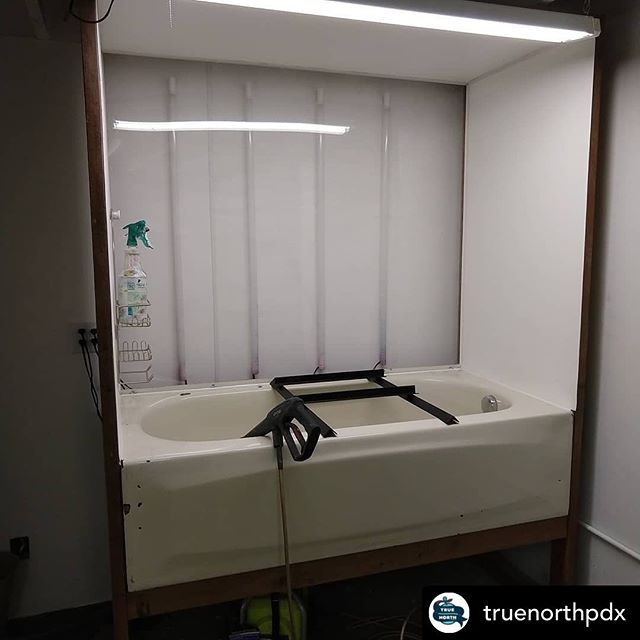
From a screen printing point of view, this video had me in awe the entire time. I'm unsure if it was the immensely huge washout booth, the automatic inline press, the conveyor drying rack, the unbelievably vibrant ink colors, the mylar tape on the screen frames -- or maybe it was all of it. What really gets me is that the process in 1970 wasn't hugely different than it is today, it's still ink going through a screen onto paper. All the technical advances in the world aren't likely to change that. There is something timeless about the process and this video really shows it.
I'll wrap up my love letter to this video by highlighting something that Steve said in reference to the screen printing process, "That last one goes on and its better than you imagined." Anyone that has ever pulled a squeegee can relate. For all the hard work that goes into the process, the first pull of the last color makes it all worth it.
Video by: Dresscode - Dresscode on Instagram
